Is there a map from prior to covid? Early on through the pandemic there were reports that it was affecting people of Mediterranean descent at a greater rate than others.
Data for Norway and Switzerland, so not just the EU
Turkiye, Georgia, and Moldova too, plus Bosnia & Herzegovina, Montenegro, Albania, North Macedonia, and Ukraine being marked as “data not available” rather than the “not intended to be part of the dataset” lighter grey. This is the Eurostat set (which the UK has now partially rejoined, but this data is from before that happened)
The 32.5% number is inside the infographic itself, though, so could well genuinely mean the EU 27 and not the average of all of the represented countries
now overalay prevelance of fish in diet and frying in diet.
you might be into something :

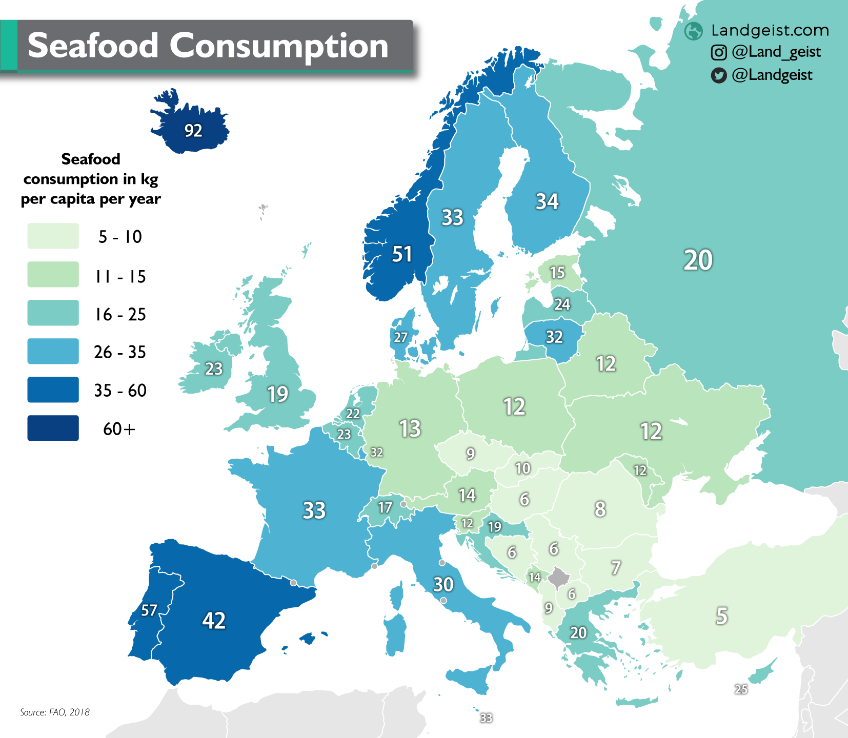
https://landgeist.com/wp-content/uploads/2021/01/europe-seafood-consumption.png
Why so little seafood in countries bordering the Caspian sea and the Adriatic sea? Are they poor seas?
Damn Lithuania, always got to mess things up for everyone
Romania, what’s going on with you?
I mean, people gotta die somehow. You could flip the map to show percentage of deaths due to cancer, and Romania would probably look quite good.
Yeah, in a similar vein, it could also potentially be due to differing standards for how causes of death are assigned.
Someone could have congestive heart failure leading to pneumonia that actually kills them, and one country might consider that cardiovascular while another does not.
There’s about a million diseases that dont actually kill you, they just lead to something else killing you. AIDS, for example.
Ongoing effects of Chernobyl?
this might be the reason, because the stat are baffling: It is not alcohol, or smoking since France rank high in those. It is not lack of sport, as Germany is one of the most sport oriented population. Is is not lack of money, as Germany and Swiss dont do so well. It is not the “mediterraneen diet” since italy dont do so good. It cant be quality of Healthcare, because germany , swiss and sweden have a great one.
It all make no sense, without some hidden factor at play
It doesn’t seem to line up very well with where the radioactive material from the disaster landed, save for in the most general sense of “more in the east”. Of the countries included in this dataset, if Chernobyl was the cause then you’d expect much higher rates in Finland, Sweden, and Austria and much lower rates in the Baltics
I don’t know, lines up with the cancer maps of post-Chernobyl decently well. (Edited to fix typo)

It doesn’t look that close to me
-
Finland: lowest death rate on the southern coast, which is almost the country’s highest Chernobyl exposure
-
Poland: almost an inverse correlation within the country, not to mention that it got one of the highest doses overall but isn’t particularly high on the death rates
-
Bulgaria and Hungary: low exposures, very high death rates
-
Turkiye and Georgia: high death rates, little to no exposure
Like, yes, there is a general correlation of more east = higher death rates and also higher doses, but there’s too much other stuff going on in the details for that to be the explanation by itself
We’ll have to wait for other peer reviewed research for causation. Still wouldn’t shock me of there was some link.
-
or alcohol?
Franche-Comté neumbeur ouanne!