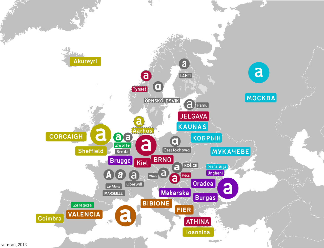
SubArcticTundra@lemmy.ml to Map Enthusiasts@sopuli.xyz · 1 year agoHighway fonts in different countrieslemmy.mlimagemessage-square31linkfedilinkarrow-up1120arrow-down15
arrow-up1115arrow-down1imageHighway fonts in different countrieslemmy.mlSubArcticTundra@lemmy.ml to Map Enthusiasts@sopuli.xyz · 1 year agomessage-square31linkfedilink
minus-squareChaoticNeutralCzech@feddit.orglinkfedilinkEnglisharrow-up10·1 year agoDIN for Germany/Czechia. Distributed by Microsoft as Bahnschrift.
minus-squareSubArcticTundra@lemmy.mlOPlinkfedilinkarrow-up9·edit-21 year agoAhh a fellow Czech road nerd Edit: you’ll like this - this was the old pre-2001 font (I’ve forgotten the name tho)
minus-squareChaoticNeutralCzech@feddit.orglinkfedilinkEnglisharrow-up4·1 year agoUniversal Grotesk. Still in use in Slovakia. What is your opinion on lowercase/uppercase and closest/farthest at the top?
minus-squareSubArcticTundra@lemmy.mlOPlinkfedilinkarrow-up3·edit-21 year agoAlso I don’t really like Grotesk as a transport typeface, it’s too bold+curvy…
minus-squaretal@lemmy.todaylinkfedilinkEnglisharrow-up3·1 year agoThe kerning on the “Od” there feels too loose to me.
minus-squareChaoticNeutralCzech@feddit.orglinkfedilinkEnglisharrow-up1·1 year agoI think it would be alright in uppercase. The problem is that lowercase height is barely above half of uppercase, as opposed to most display fonts.
minus-squareSubArcticTundra@lemmy.mlOPlinkfedilinkarrow-up2·1 year agoWhat do u think about the British font?
minus-squareChaoticNeutralCzech@feddit.orglinkfedilinkEnglisharrow-up2·edit-21 year agoIn terms of British transport fonts, nothing beats Johnston but that already has its place on the Tube. This one is a good silver medalist.
minus-squareSubArcticTundra@lemmy.mlOPlinkfedilinkarrow-up2·edit-21 year agoI personally prefer lowercase as it makes the names less uniform in shape therefore better recognisable. I don’t have an opinion on the second one though. Also btw I have a feeling the Slovaks now use the Austrian font
minus-squaretimestatic@feddit.orglinkfedilinkEnglisharrow-up5·1 year agoFound it one Wikipedia for Germany under DIN 1451 Mittelschrift. You can download and use it legally even under the OFL license for free.


DIN for Germany/Czechia. Distributed by Microsoft as Bahnschrift.
Ahh a fellow Czech road nerd
Edit: you’ll like this - this was the old pre-2001 font (I’ve forgotten the name tho)
Universal Grotesk. Still in use in Slovakia.
What is your opinion on lowercase/uppercase and closest/farthest at the top?
Also I don’t really like Grotesk as a transport typeface, it’s too bold+curvy…
The kerning on the “Od” there feels too loose to me.
I think it would be alright in uppercase. The problem is that lowercase height is barely above half of uppercase, as opposed to most display fonts.
What do u think about the British font?
In terms of British transport fonts, nothing beats Johnston but that already has its place on the Tube. This one is a good silver medalist.
Johnson feels very British
I personally prefer lowercase as it makes the names less uniform in shape therefore better recognisable. I don’t have an opinion on the second one though. Also btw I have a feeling the Slovaks now use the Austrian font
Found it one Wikipedia for Germany under DIN 1451 Mittelschrift. You can download and use it legally even under the OFL license for free.