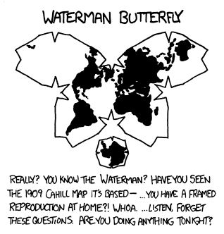
Oh that’s a much better link, thanks, I’ll edit the post
Hunches and gut feelings. Dreams in waking life.
- 5 Posts
- 1 Comment
Joined 1 year ago
Cake day: August 1st, 2023
You are not logged in. If you use a Fediverse account that is able to follow users, you can follow this user.

deleted by creator