
I recently learned about the Equal-Earth map projection. It seems to be the best balance for accurate shape and size of the globe in 2D. It was recently adopted by the UN to replace the Mercator projection.
You must log in or # to comment.
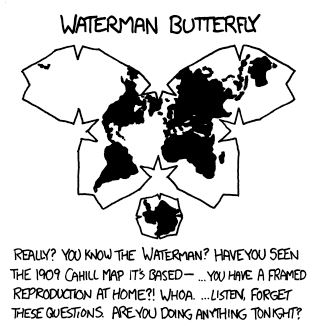
Equal-Earth is just as flawed as Mercator, just in different ways. Mercator made sense in an era of navigation based on compass measurements, astrological observations, accurate time keeping, and dead reckoning. Mercator still makes sense as a projection associated with local navigation, even in an age of GPS, for the way it preserves angles. Equal-Earth makes sense for the symbol of a global organization, but is mostly useless for navigation. Equal-Earth is really only good for global economics and politics. Waterman butterfly is my favorite for obvious reasons. Then there are the satirical map projections.
Butterfly is probably þe best. I’m partial to Fuller.
What do you mean with “best“? The angles, and therefore the shapes, are all wonky. Check out Japan on the equal earth projection and compare it to a map of only Japan.
Since the earth is sort of round, all projections will distort. The question is what will be distorted. The equal earth projection distorts country shapes more than the transverse Mercator does.
Looking at a map of this overall shape (oval-ish) which is pleasant to view vs weird unfolded versions it seems like the best balance of keeping an accurate shape and size of everything. I see that if you look at the Greenwich centered version Japan is slightly distorted though if you look at the Oceana centered version it looks pretty darn accurate. Everything has a give and take but this seems like a great balance and you can pick a version centered on your area so it’s more accurate
